
The short answer: if you want a room to feel calmer, I’d start with soft blues, muted greens, and warm neutrals. In many cases, those colors feel easier on the eyes than bold reds, oranges, or sharp black-and-white contrast.
Here’s the main takeaway in plain English:
- Blue and green often work best for rest, focus, and lower visual stress.
- Warm whites, greiges, and taupes can make a room feel quiet without looking stark.
- High saturation, very dark paint, and strong contrast can make a space feel more tense.
- Lighting, undertones, and sheen matter just as much as the color name.
- Test paint on the wall for 48 hours and check it in morning, afternoon, and night light.
- For restful rooms, 2,700K bulbs are a solid place to start.
- Low- or zero-VOC paint can help cut down on paint smell and post-paint headaches.
A few numbers stand out. One study cited blue rooms at 7 hours, 52 minutes of sleep per night, versus 5 hours, 56 minutes in purple rooms. Another found powder blue linked to a 15% drop in anxiety within 20 minutes. Light lavender was also tied to up to 23% better sleep quality.
If I were choosing interior painting for stress relief, I’d keep it simple: pick a muted color, match it to the room’s light, and avoid anything that feels too bright, too dark, or too sharp once it hits the wall.
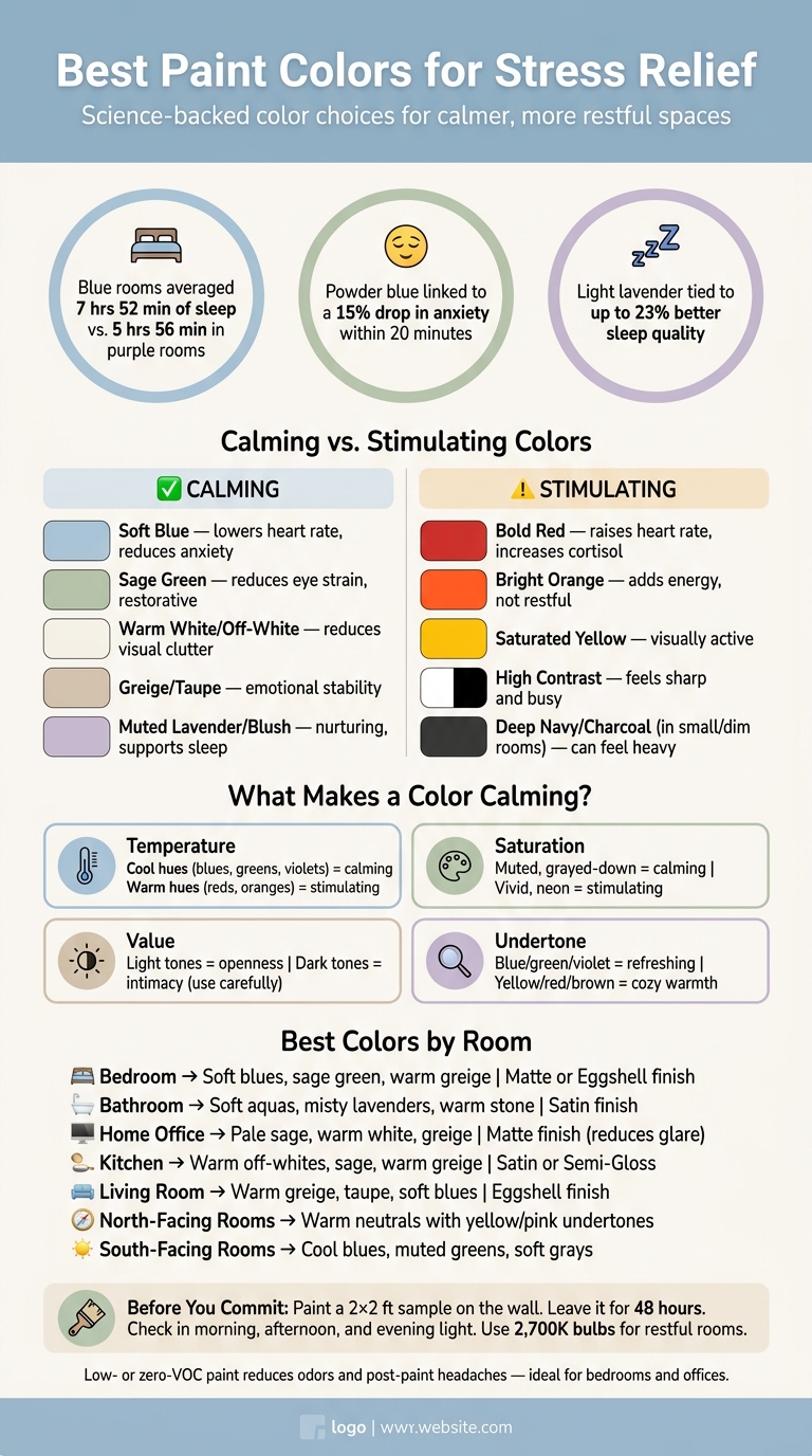
Best Paint Colors for Stress Relief: Science-Backed Guide
Guide to Colors That Make Us Feel Calm or Energetic – Color Psychology in Interior Design
sbb-itb-a2baf13
The science behind calming paint colors
Some colors feel restful because of the way the eye and brain respond to them. Color can shift mood fast, which is why hue, saturation, value, and undertones have such a strong effect on how a room feels. Those four traits often decide whether a space feels calm or a bit on edge.
Cool hues, warm hues, and stress levels
Cool colors – blues, greens, and soft violets – tend to feel calmer because they create less visual activity. Blue, especially, has been linked to reduced blood pressure and better focus. In one study, people in blue rooms averaged 7 hours and 52 minutes of sleep per night, compared with 5 hours and 56 minutes for those in purple rooms.
Warm colors like red, orange, and bright yellow usually add energy and visual movement. That can work well in busy, social spaces like kitchens, where cabinet repainting can refresh the energy. But for rooms meant for rest or recovery, they’re often a weaker fit.
The biggest shifts usually come from four things: temperature, intensity, lightness, and undertone.
Saturation, value, and undertones
Saturation is the strength of a color. A neon green and a soft sage are both green, but on a wall, they land in very different ways. High-saturation colors feel active and loud. Muted, grayed-down tones feel calmer and more settled.
Value refers to how light or dark a color is. Lighter colors can make a room feel more open. Darker shades soak up more light and can create a cocoon-like feel, though in a small, dim room they may also feel heavy.
Undertones are the subtle colors sitting below the main shade. This is where things can go sideways fast. A pink-beige next to yellow wood can feel off and a little uneasy. Blue undertones usually read cooler than brown or green undertones.
These traits don’t work at random. They shape comfort in ways that are pretty consistent.
Table: How color properties affect emotional comfort
| Color Property | Calming Characteristics | Stimulating Characteristics | Best Use |
|---|---|---|---|
| Temperature | Cool (blues, greens, violets) | Warm (reds, oranges, yellows) | Cool for rest; warm for social energy |
| Saturation | Muted, dusty, grayed-down | Vivid, neon, highly saturated | Muted for full walls; vivid for accents only |
| Value | Light (high reflectance) | Dark (deep, saturated) | Light for openness; dark for intimacy |
| Undertone | Blue, green, violet (cool) | Yellow, red, brown (warm) | Cool to refresh; warm to cozy up |
With the science in place, the next step is picking the shades that make sense in actual rooms.
The best calming paint colors and where to use them
Pick calming colors based on how you want the room to feel: restful, focused, or low-stimulation. The right color family should also match the room’s job and the amount of light it gets.
Soft blues and muted greens for bedrooms, bathrooms, and offices
Blue is one of the best-studied stress-relief colors. It’s linked to lower heart rates and reduced stress responses, and people surrounded by powder blue saw a 15% drop in anxiety levels within 20 minutes. That’s why shades like sky blue, blue-gray, sage, and soft olive make so much sense in bedrooms, bathrooms, and home offices. If a room doesn’t get much daylight, a misty blue can work especially well.
Muted green is also easy to live with over time. That makes it a smart fit for home offices and small business offices, where people may spend hours at a desk. One thing to watch: in north-facing rooms or spaces with limited natural light, cool blues and greens can look flat or chilly. Warm accents – like aged brass fixtures, white oak shelving, or linen textiles – help soften that effect without losing the calm feel.
In low-light rooms, pair these shades with warm materials so they stay calm instead of cold.
Warm whites, greiges, taupes, and blush tones for low-stimulation spaces
Warm neutrals like greige, taupe, and off-white cut down visual noise without feeling sterile. That makes them a good fit for living rooms, entryways, waiting areas, and other spaces that need to feel easy and relaxed without drawing too much attention to themselves.
Pure, bright white can come off as clinical, especially under artificial light. Off-whites with soft red or yellow bases – like a soft off-white – keep the brightness but lose the sharp edge. Blush and muted lavender can do something similar. In softer versions, they create a gentle, nurturing mood, especially in bedrooms. Light lavender has been shown to improve sleep quality by up to 23%. The catch is simple: stay with soft, grayed-down shades. Strong pinks or saturated lavenders can shift from soothing to overstimulating fast.
For the best result, match the undertone to the room’s light and finishes.
Table: Calming color families, emotional effect, best rooms, and cautions
| Color Family | Emotional Effect | Best Rooms | Key Cautions |
|---|---|---|---|
| Soft Blues | Lowers heart rate; reduces anxiety | Bedrooms, bathrooms, offices, spa-style areas | Can feel cold or "icy" in north-facing or low-light rooms |
| Muted Greens (sage, olive) | Reduces eye strain; restorative | Offices, kitchens, entryways, studies | High saturation feels overwhelming in small rooms |
| Warm Whites & Off-Whites | Reduces visual clutter; clean and welcoming | Living rooms, waiting areas, nurseries | Can look yellow or dingy if undertones clash with lighting |
| Greiges & Taupes | Emotional stability; "neutral mediator" | Hallways, open-concept spaces, mudrooms | Can feel flat without textured decor or layered lighting |
| Blush & Muted Lavender | Nurturing; supports sleep quality | Bedrooms, nurseries, restorative spaces | Intense pinks can agitate; stick to dusty or grayed-down tones |
Even calming colors can change a lot once light hits them, so test each one in the actual room before you commit. Next, narrow the palette by trying shades that need a bit more caution in real light.
Colors to use with care and how to choose the right shade
When red, orange, yellow, dark colors, and strong contrast add tension
Even calm paint colors can start to feel tense if they’re too saturated, too dark, or used in the wrong space. Bold warm tones can work, but they usually do best in small amounts. Red, orange, and saturated yellow may increase heart rate and cortisol, which can make a room feel busy instead of restful.
High-contrast rooms can have the same effect. Think stark white walls with very dark furniture. That look can feel sharp and busy, which makes it harder to settle in.
Deep shades like navy or charcoal aren’t always a bad call. In a large, south-facing room with lots of daylight, they can feel steady and grounded when paired with lighter finishes. But in a small, north-facing, or dim room, those same colors can feel heavy or muddy. That’s why it’s smart to use more stimulating colors as accents instead of putting them across every wall.
How to test paint samples by light, time of day, and room function
If a color feels right on paper, test it in the room before you commit. Paint a 2-foot-by-2-foot sample directly on the wall, and if you can, try it on two different walls. Then leave it up for at least 48 hours.
Check the sample in morning light, afternoon light, and at night. Also test it under the bulb color you plan to use. Light changes everything, and a shade that looks soft in one setting can look much harsher in another. For spaces meant for rest, 2,700K bulbs are a solid starting point.
It also helps to hold the sample next to your flooring, trim, and cabinets. Undertones that clash with fixed finishes are one of the most common paint mistakes, and they’re easy to miss until the whole room is done.
Choose low-VOC or zero-VOC paint too. It can help cut down on odors and headaches during and after painting.
Table: Room type, light conditions, recommended color families, and sheen
| Room Type | Light Conditions | Recommended Color Families | Best Sheen |
|---|---|---|---|
| Bedroom | Dim, warm (2,700K) | Soft blues, sage green, warm greige | Matte or Eggshell |
| Living Room | Variable, natural | Warm greige, taupe, soft blues | Eggshell |
| Kitchen | Bright, functional | Warm off-whites, sage, warm greige | Satin or Semi-Gloss |
| Home Office | Long-use, cooler | Pale sage, warm white, greige | Matte (to reduce glare) |
| Bathroom | Bright, artificial | Soft aquas, misty lavenders, warm stone | Satin |
| North-Facing Rooms | Cool, indirect | Warm neutrals with yellow or pink undertones | Eggshell |
| South-Facing Rooms | Warm, direct | Cool blues, muted greens, soft grays | Matte |
Putting a calming color plan into practice
How to build a consistent whole-home or workplace color palette
After you test single shades, the next step is to pull them into one calm palette. This works best when each room feels connected to the next. A simple way to do that is to anchor the space with one neutral base, then change the depth or accent color from room to room.
A good place to start is the 60-30-10 rule: about 60% warm neutral, 30% natural finishes and textures, and 10% one restrained accent like sage green or dusty rose. That mix helps each room feel a little different without adding visual clutter.
It also helps to keep undertones steady from room to room. In plain terms, pick warm or cool and stick with it. Then use lighter or darker versions of those colors to make the shift between spaces feel smooth. Ceilings painted a bit lighter than the walls can make a room feel more open and ease visual pressure.
Using the same trim color throughout the home creates a quiet frame that ties everything together without pulling focus.
How 26 Painting, LLC can help with stress-relief interior painting

Once the palette is set, the paint job itself matters just as much as the color. Surface prep and finish choice change how paint looks on the wall. 26 Painting, LLC can help with interior painting, surface prep, finish selection, and low- or zero-VOC paints so the color looks the way it did in testing.
Their low- or zero-VOC paint options can cut indoor odors, which can matter a lot in bedrooms and home offices. They can also guide finish choices based on how each room is used – matte for a quieter look in bedrooms, satin for the wear and moisture that kitchens and bathrooms deal with.
Conclusion: Key rules for choosing relaxing paint colors
Soft blues, muted greens, and warm neutrals are the safest picks for rest and focus. Intense warm colors like red usually work better in small doses than across all four walls.
And color alone doesn’t decide how a room feels. Undertones, sheen, and lighting all play a big part. The same paint can look different under cooler light than it does under a warmer 2,700K bulb. Those details can make the difference between a room that feels restful and one that only seems like it should.
FAQs
What if my room gets little natural light?
If your room doesn’t get much natural light, skip dark paint colors. They can make the space feel heavy and cold.
A better pick is soft, warm whites or light warm neutrals like greige. These shades bounce light around the room and help it feel brighter and more open.
It’s also smart to be careful with cool blues or gray-toned blues. In dim rooms, they can come across as sterile or even a little gloomy.
Before you commit, test paint samples directly on your walls and check them at different times of day. Morning light, afternoon light, and lamplight can all change how a color looks.
Can dark paint feel relaxing?
Yes. Dark paint can feel relaxing when you choose the right undertones and pay close attention to lighting.
Deep, grounded colors like navy or earthy shades can make a large room feel cozy and calm. For some people, deep charcoal has that same effect too. Color is personal, so what feels restful to one person may feel a bit heavy to someone else.
The main thing is balance. If you don’t want the room to feel boxed in, pair dark walls with intentional design, layered lighting, and soft textures.
How do I choose the right undertone?
Undertone shapes how a color feels and how it acts as light shifts through the day. Two shades that look close on a paint chip can land very differently on a wall. A gray with blue undertones reads cooler and calmer. A gray with green or brown undertones comes across warmer and more enveloping.
Paint samples on your walls and check them at different times of day. Morning light, afternoon sun, and lamps at night can all pull out different undertones. If you want a steady, comfortable look from room to room, professional painters can help keep things consistent.