
I’d start with warm white and use one wall color across your living, dining, and kitchen areas. If it doesn’t suit your floors or cabinets, compare soft greige, light beige, and muted sage.
The best choice depends on daylight, fixed finishes, and how the walls look across connected spaces – not just a paint swatch.
Quick Comparison
| Paint color | Best reason to choose it | What I’d check |
|---|---|---|
| Warm white | A bright, lightly warm backdrop | Creamy or yellow tones in strong sunlight |
| Soft greige | A balance between warm and cool finishes | Gray, pink, or green undertones in shaded areas |
| Light beige | A warmer, cozy backdrop | Clashes with cool stone or excess warmth near wood |
| Muted sage | Gentle color without a bold green look | Whether it turns too gray or blue beside your finishes |
Before committing, I’d test two or three shades on 12-by-12-inch sample boards beside flooring, cabinets, and furniture. Check them morning, afternoon, and evening, including under your usual bulbs.
My rule: <u>keep the walls connected; separate the zones with rugs, lighting, and furniture</u>. Then choose trim and ceiling whites with matching undertones, and repair and prime surfaces before painting. For homes built before 1978, use lead-safe practices.
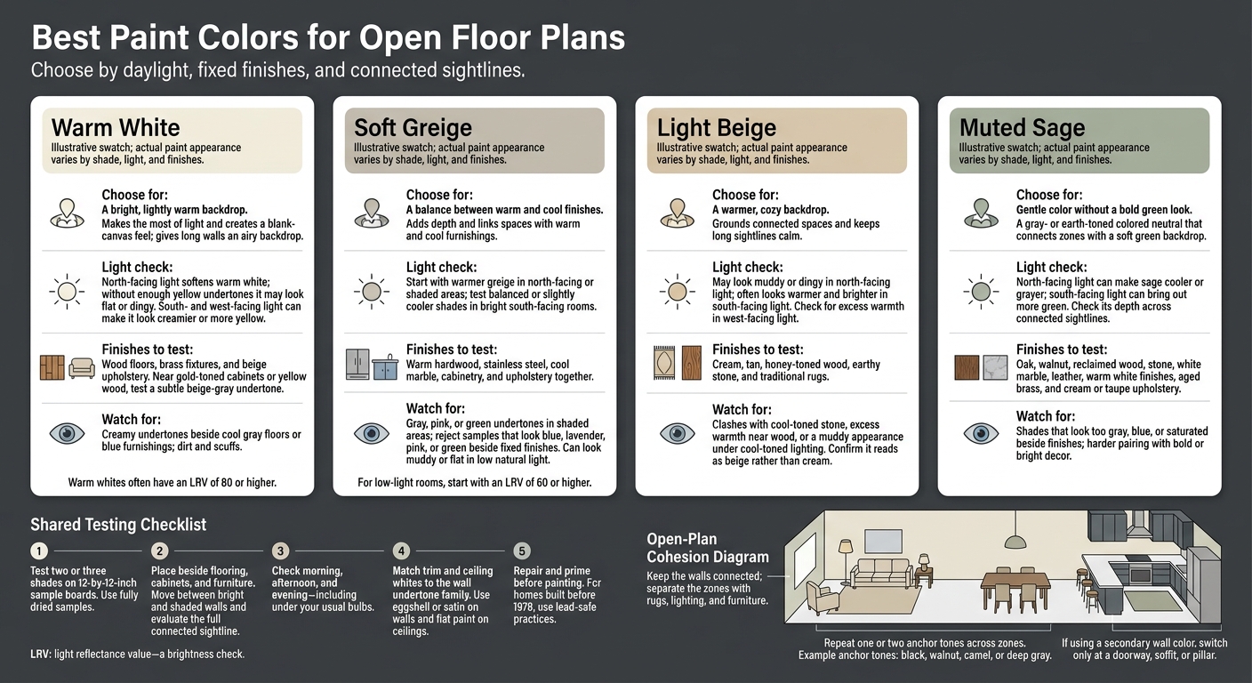
Best Paint Colors for Open Floor Plans: Compare 4 Options
10 Paint Colors That Make Open Concept Homes Feel Calm & Elegant
sbb-itb-a2baf13
1. Warm White
Warm white is the safest starting point for an open floor plan.
Visual Cohesion
Warm white brightens dark floors and large furniture without the sharp contrast of cool white. Carry it onto wall returns and through transition areas to keep the space visually connected.
How Light Changes It
North-facing light softens warm white. South- and west-facing light can make it look creamier or more yellow.
Once you’ve checked the light, see how the color looks beside permanent finishes.
Flooring and Furnishing Compatibility
Warm white works well with wood floors, brass fixtures, and beige upholstery. Near gold-toned cabinets or yellow wood, choose a warm white with a subtle beige-gray undertone.
Define Zones with Accents
Use rugs and dark accents to separate zones while keeping the same wall color. In the living room, choose a rug large enough to fit the front legs of the main seating.
Repeat one or two anchor tones – black, walnut, camel, or deep gray – across the living, dining, and kitchen areas to tie them together.
If warm white feels too plain, soft greige adds depth while keeping the spaces connected.
2. Soft Greige
Soft greige gives walls more depth than warm white without disrupting the flow of an open floor plan.
Visual Cohesion
Soft greige connects warm and cool furnishings. Its gray-beige balance adds subtle definition to walls. Use it across all shared walls, including the entry, to keep the space unified.
Natural-Light Response
Choose a warmer greige for north-facing or shaded areas. In bright south-facing rooms, a balanced or slightly cooler shade works well. For low-light rooms, start with an LRV of 60 or higher.
Flooring and Furnishing Compatibility
Before choosing, test greige against your flooring, cabinetry, and upholstery. Place fully dried 12-by-12-inch samples on both bright and shaded walls. Check them in the morning, at midday, in the evening, and under your usual bulbs. If the paint looks blue, lavender, pink, or green beside fixed finishes, try a different undertone.
Zone Definition and Accent Coordination
Pair it with off-white textiles, charcoal accents, muted blue accents, and black metal finishes. Muted blue adds a subtle color note. Keep stronger contrasts in movable furnishings, and repeat accent finishes across zones. This keeps each area distinct without breaking the backdrop.
For a warmer backdrop, light beige is the next step.
3. Light Beige
If greige feels too cool, light beige gives the space the same open feel with a warmer tone.
Visual Cohesion
Light beige keeps long sightlines calm and brings warmth to the kitchen, dining, and living areas.
Natural-Light Response
It stays warm in shaded spots and soft in direct sunlight.
Flooring and Furnishing Compatibility
Test the paint beside cream, tan, and honey-toned wood to make sure it reads as beige rather than cream.
Zone Definition and Accent Coordination
Use the same wall color throughout, then define each zone with olive, navy, or muted terracotta accents.
For a cooler backdrop with more color, muted sage is the next step.
4. Muted Sage
Muted sage gives you more color than beige while keeping the backdrop calm and connected.
Visual Cohesion
Gray- or earth-toned sage works as a colored neutral, offering softer color than stronger greens. Using sage across living, dining, and kitchen walls reduces visual breaks between spaces, especially with hardwood or stone flooring.
Natural-Light Response
North-facing light can make sage look cooler or grayer. South-facing light can bring out more green. Avoid shades that look too blue or saturated.
Flooring and Furnishing Compatibility
Look for muted undertones that pair well with oak, walnut, reclaimed wood, and stone. Check the paint alongside warm white finishes, aged brass, and cream or taupe upholstery.
Zone Definition and Accent Coordination
Repeat the same sage tone in smaller accents to give each zone its own identity while keeping the spaces visually linked – without adding a second wall color.
Compare Colors by Light, Finishes, and Sightlines
Compare these four shades side by side to find the best fit for your open floor plan.
Visual Cohesion. Judge brightness and depth across the full sightline – not just within one room. Use light reflectance value (LRV) for a quick brightness check. Warm whites often have an LRV of 80 or higher.
| Color family | Brightness, warmth, and depth | Effect across connected rooms |
|---|---|---|
| Warm white | High brightness with gentle warmth | Gives long walls an airy backdrop |
| Soft greige | A balance of gray and beige | Links spaces with warm and cool finishes |
| Light beige | Warmth with added depth | Grounds connected spaces |
| Muted sage | Subtle color | Connects zones with a soft green backdrop |
Natural-Light Response. Check how each shade looks in the daylight your rooms receive.
| Color family | North-facing daylight | South-facing daylight | East- and west-facing checks |
|---|---|---|---|
| Warm white | May look flat or dingy without enough yellow undertones | Can look creamy or yellow | Watch for too much creaminess |
| Soft greige | Helps balance cooler light | Maintains a balance of warm and cool tones | Watch for gray or beige undertones |
| Light beige | May look muddy or dingy | Often looks warmer and brighter | Check for too much warmth in west-facing light |
| Muted sage | May look moody | Can soften intense south-facing light with a cooler tone | Check whether its depth works across connected sightlines |
Flooring and Furnishing Compatibility. Start with the largest fixed surface, usually the flooring. Then look at cabinets, countertops, and upholstery together in one view.
| Color family | Finishes to assess together | Main concern |
|---|---|---|
| Warm white | Warm wood and brass | Creamy undertones may clash with cool gray floors or blue furnishings |
| Soft greige | Warm hardwood, stainless steel, and cool marble | Choose a shade that ties the finishes together rather than favoring just one |
| Light beige | Earthy stone and traditional rugs | Cool-toned lighting can make the palette look muddy |
| Muted sage | White marble and leather | Check the green against fixed finishes before using it across multiple spaces |
Zone Definition and Accent Coordination. Keep one color on long, uninterrupted walls. Switch to a secondary color only at a doorway, soffit, or pillar.
Pros, Cons, and Steps for Choosing Your Palette
| Color family | Main advantage | Primary limitation | Best-fit setting |
|---|---|---|---|
| Warm white | Makes the most of light and creates a blank-canvas feel | Shows dirt and scuffs easily | Modern or minimalist open plans with plenty of natural light |
| Soft greige | Balances warm and cool tones, pairing well with different finishes | Can look muddy or flat in low natural light | Transitional homes with wood and metal finishes |
| Light beige | Adds warmth and a cozy feel right away | Can look dated or clash with cool-toned stone | Classic or rustic spaces with heavy wood elements |
| Muted sage | Creates a calm, nature-inspired, organic feel | Harder to pair with bold or bright decor | Open areas connected to kitchens or outdoor views |
Use the chart to narrow your choices, then test your top two or three colors against your flooring, cabinets, and sightlines.
- Test samples: Apply each color to large boards or use peel-and-stick samples. Move them across bright and shaded walls throughout the day to see how the light changes their appearance.
- Coordinate finishes: Keep trim and ceiling whites in the same undertone family. Change the sheen, not the color family: use eggshell or satin on walls and flat paint on ceilings.
- Prepare surfaces: Repair and prime before painting. In homes built before 1978, follow lead-safe practices.
Final Recommendation: Match the Color to Your Home
Compare the light, finishes, and sightlines, then choose wall undertones that work with your flooring and cabinetry. Go with warm white for brightness, soft greige to tie mixed finishes together, light beige for warmth, or muted sage for a gentle touch of color.
Test your choice with full paint samples on the walls next to flooring, cabinetry, and furnishings. Check them in both daylight and evening lighting.
Use one wall color throughout connected living, dining, and kitchen areas. Define each zone with furniture placement, rugs, lighting, cabinetry, trim, beams, or built-ins – not abrupt color changes.
FAQs
How do I choose one color for areas with different lighting?
Test paint samples in every connected space before committing. Paint foam boards so you can move them between your living, dining, and kitchen areas. Check the shade throughout the day under both natural and artificial light.
Lighting can change how the color and finish look. Make sure your choice suits each space and helps the rooms feel connected.
What if my floors and cabinets have conflicting undertones?
Test paint swatches in your space before painting the whole room. Check them in natural light alongside your flooring and cabinetry. Lighting and nearby finishes can change how a color looks.
If you’re unsure which colors work best, a professional consultation can help you pick shades that complement your existing finishes and bring the room together.
Can I add an accent wall without disrupting visual flow?
Yes. Pair light, neutral walls with a darker or bolder accent color that complements them. The contrast adds depth and visual interest without throwing the room off balance. Keep the other walls consistent across connected spaces so the accent defines one area without making the design feel disjointed.
For a polished statement accent, try a high-gloss finish. Its reflective surface draws the eye while keeping the look sophisticated.