
I recommend starting with one base neutral and keeping your whole-house palette to 3–5 wall colors, plus trim and ceiling colors. Choose shades that work with your floors, cabinets, and furniture – not just colors you like on a paint card.
Here’s the order I’d follow:
- Map the rooms: Repeat colors where spaces connect, and save stronger contrasts for enclosed rooms.
- Check the light: Match color intensity to each room’s use, and test shades in daylight and under your usual bulbs.
- Choose trim and sheens: Keep trim consistent, and select finishes suited to each surface’s cleaning needs.
- Test before buying: Compare 2–3 finalists on large samples beside your finishes, morning through evening.
- Write the paint plan: Record colors, products, sheens, prep, coat counts, and quantities before work begins.
My rule: judge paint in your home, not just in the store. <u>Approve the samples before ordering paint</u> – and check adjoining rooms together.
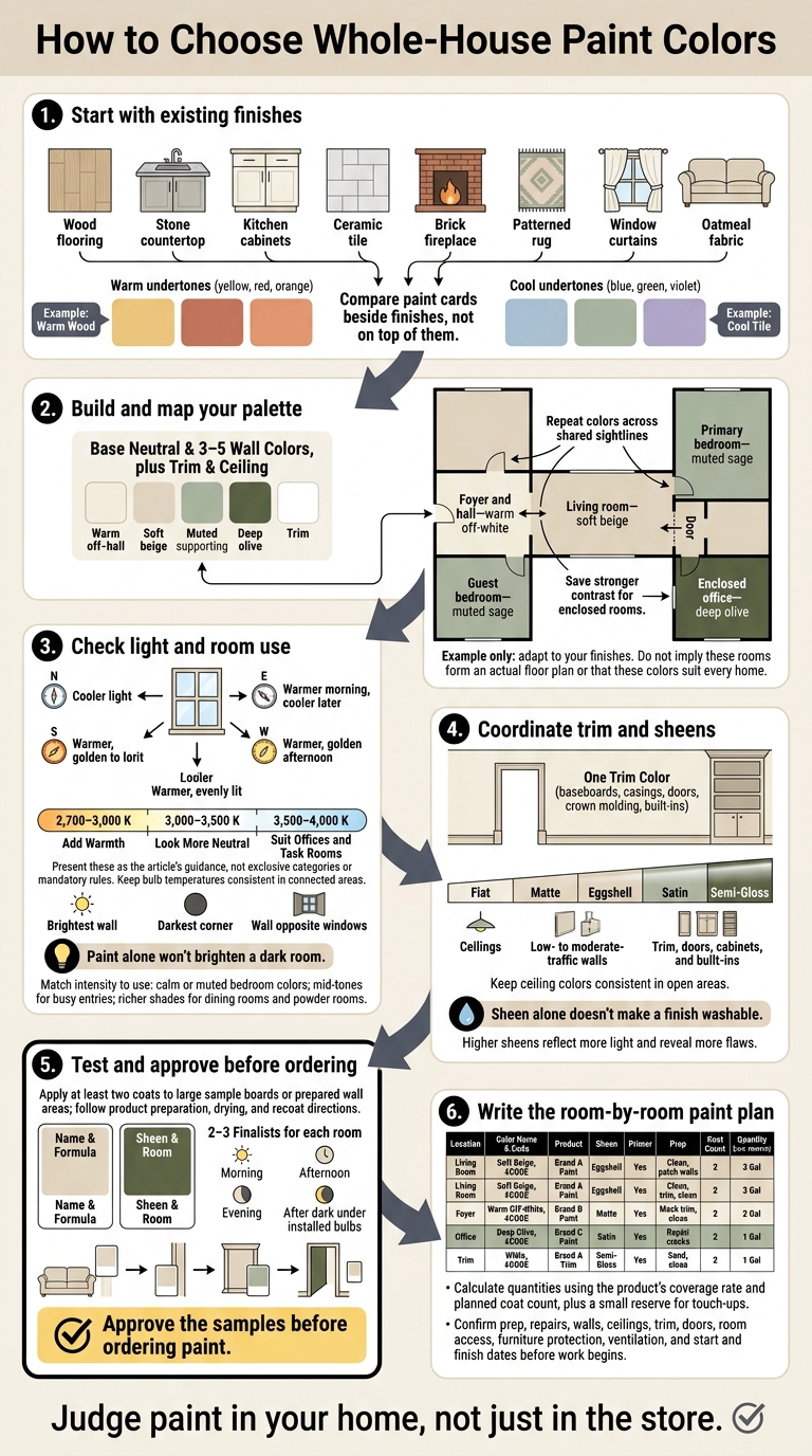
How to Choose Whole-House Paint Colors
1. Start With Your Home’s Existing Finishes
Build your palette around what’s already in your home: flooring, countertops, cabinets, tile, fireplaces, exposed brick, rugs, window treatments, and large furniture. Photograph each room in daylight and artificial light. Then note which finishes you can see from adjoining spaces. Those shared sightlines and existing undertones should guide your whole-home palette.
Identify Undertones in Floors, Cabinets, and Furniture
Undertones are the subtle colors beneath a material’s main color. Compare each finish with a neutral reference rather than judging it alone. Look for warm hints of yellow, red, or orange, or cool hints of blue, green, or violet.
Place paint cards beside – not on top of – flooring, countertops, and upholstery. Both the lighting and surrounding colors can change how those undertones look.
If warm cabinets and cool flooring clash, test a restrained greige against both.
Once the undertones work together, narrow your room colors to a few coordinated choices.
Choose a Base and 3–5 Wall Colors
Keep your whole-house palette to 3–5 wall colors, with separate colors for trim and ceilings. Give each wall color a job: a base that connects spaces, supporting shades for individual rooms, and a deeper accent for an enclosed room.
Use closely related colors where rooms share sightlines. Instead of choosing a new shade for every room, repeat a supporting color.
Map Colors and Room-to-Room Transitions
Sketch a floor plan and mark doorways, hallways, open arches, stairs, and any sightlines where you’ll see two colors at once.
Analogous colors sit beside each other on the color wheel and create gentle transitions. Complementary colors sit opposite each other and create stronger contrast. For a softer version of that contrast, choose muted or desaturated shades. Apply these color relationships where rooms meet, whether through a doorway or an open sightline.
Sample palette framework. Adapt these color families to your finishes.
Room Existing finishes Proposed wall color Undertone Adjoining-room transition Foyer and hall Oak flooring, black hardware Warm off-white Warm beige Connects to beige living room Living room Oak floor, cream sofa, brass accents Soft beige Warm beige Subtle shift from off-white Primary bedroom Natural wood, linen textiles Muted sage Soft green/warm neutral Gentle transition from beige Guest bedroom Light carpet, woven rug Muted sage Soft green Repeats the bedroom color Enclosed office Dark wood desk, leather chair Deep olive Warm green Contrast from hallway off-white
Keep trim and ceiling colors consistent throughout the house, adjusting sheen to suit each surface and how the room is used. Use your color map as the starting point for lighting and sheen tests.
sbb-itb-a2baf13
2. Account for Lighting and Room Use
Check Natural Light and Light Bulbs
Use the palette you’ve already mapped to check how each color looks in the room’s actual light. The same paint can look different from room to room because daylight, bulbs, and nearby surfaces affect its appearance.
Note which direction the room faces, window size, anything blocking the light, window treatments, and when sunlight enters. North-facing rooms usually look cooler; south-facing rooms tend to look warmer and more evenly lit. East-facing rooms may feel warmer in the morning and cooler later. West-facing rooms often take on warmer, golden light in the afternoon.
Before choosing a color, check it on the brightest wall, in the darkest corner, and on the wall opposite the windows. Then see how it looks under artificial light.
Check your bulbs’ Kelvin ratings before choosing paint. Bulbs around 2,700–3,000 K add warmth, 3,000–3,500 K looks more neutral, and 3,500–4,000 K suits offices and task rooms. Keep bulb temperatures consistent in connected areas, and test colors with your usual lamps and overhead fixtures turned on.
For a dim room, start with warm white, beige, or light greige. Paint alone won’t brighten a dark room. Lighting, ceiling height, and reflective surfaces matter, too. Add layers of lighting if the room needs more balance. A darker shade can still create an intimate or dramatic feel – just test it under the lighting you use in the evening.
Once you’ve checked the lighting, match the color’s intensity to how you use the room.
Match Color Intensity to Room Use
Let the room’s purpose guide color intensity without interrupting the flow between spaces. Calm neutrals or muted blues and greens work well in bedrooms. In busy entries, mid-tones tend to hide everyday marks better than very pale colors. Dining rooms and powder rooms can take richer shades. For an office, check the color alongside your desk and shelving, as well as in your video-call background.
Look at each room from outside it, too. Stand in doorways, on stair landings, and across open living areas to see how the colors work together. Keep shifts subtle in connected spaces, and save stronger changes for rooms separated by doors or clear architectural breaks.
Check these views in daylight and after sunset. Once wall color intensity is set, move on to testing trim colors, sheens, and large samples in the room.
3. Choose Trim Colors and Sheens, Then Test
With your wall palette set, choose the trim and ceiling colors and the sheen for each surface.
Coordinate Trim, Doors, and Ceilings
Use one trim color for baseboards, casings, doors, crown molding, and built-ins. Match its undertone to the walls and fixed finishes. Keeping your existing trim? Choose wall colors that work with it.
For a continuous look, paint trim the same color as the walls but use a different sheen. Contrasting trim draws attention to architectural details. Ceilings can match the trim, use a lighter version of the wall color, or repeat another color from your palette. Keep ceiling colors consistent in open areas. Test samples on a vertical or angled board, since a color overhead can look different from the same color on a wall.
Select Sheens for Each Surface
Start with flat or matte for ceilings, matte or eggshell for low- to moderate-traffic walls, and satin or semi-gloss for trim, doors, cabinets, and built-ins. Where surfaces need frequent cleaning, choose washable wall paint – sheen alone doesn’t make a finish washable. Higher sheens reflect more light, but they also make flaws easier to see.
Record each surface’s color, sheen, and product line in your room-by-room planning table.
Test Large Samples Throughout the Day
Use paint chips and digital renderings to narrow your choices, not to make the final call. Pick two or three finalists for each room, then apply at least two coats to large sample boards or prepared wall areas. Follow the product’s preparation, drying, and recoat directions. Label every sample with its color name, formula, sheen, and room.
Move the boards between walls and place them beside flooring, cabinets, countertops, furnishings, and trim. Check them in bright light and shade during the morning, afternoon, and evening. After dark, use the room’s installed bulbs. Note any unwanted yellow, blue, gray, overly saturated, or too-dark shifts.
View adjoining rooms’ samples together from doorways and hallways. Check that the trim connects the rooms and that the wall colors work together.
Conclusion: Finalize Colors and Plan the Painting
Finalize your palette once the finishes, base color, room colors, and trim work well together in both daylight and your home’s lighting. Check how colors flow from room to room before ordering paint.
Create a room-by-room paint schedule that includes color names and codes, room locations, sheens, primer, coat counts, and quantities. Use the product’s coverage rate and planned number of coats to calculate how much paint you’ll need, plus a small reserve for touch-ups.
Before work starts, make sure the estimate lists prep, repairs, walls, ceilings, trim, and doors separately. Agree on room access, furniture protection, ventilation, and start and finish dates.
New Jersey homeowners who want help carrying out the plan can request an estimate from 26 Painting, LLC at 26painting.com. Ask about interior painting, prep work, and eco-friendly paint options.
FAQs
Where should I change colors in an open floor plan?
Change colors at natural boundaries, such as doorways, trim, or ceiling lines, so they don’t interrupt sightlines. Use one main neutral on most walls to tie the space together. Then define zones with complementary colors or accent shades on selected walls. For clearer separation, try color blocking on feature walls.
Keep the same paint sheen throughout the open area. Test swatches under different lighting conditions and at different times of day.
How can I coordinate paint with mixed wood tones?
Compare paint swatches directly against your home’s wood finishes to see whether their undertones work together or clash. Wood grain and stains reflect light differently, so test large paint samples on movable boards instead of painting directly on the wall.
Place the boards near wood features and check them at different times of day. Both natural and artificial light can change how the wood and paint look.
Should I choose paint before buying new furniture?
Before you settle on paint colors, look at your furniture and decor. Your furnishings, rugs, and decorative pieces give you a starting point for a palette that ties your home together.
Hold paint swatches next to your flooring and furniture to check for clashing undertones. Take colors, patterns, and textures into account, too – they all play a part in creating a balanced look.